Markal® Re-Branded

Pushing towards better is in LA-CO Industries’ DNA. In 1934, Dr. Lester Aronberg founded the Chicago-based company with his creation of the Original Paintstik, then named Stick-O-Paint, a solid stick of paint that pioneered the marking solutions category. His philosophy was to deliver high-performance products that were precisely engineered for specific industrial applications. It’s this same philosophy that continues to drive LA-CO Industries, Inc. forward today. After more than 85 years of hard work, and hundreds of products that have enhanced the quality and production of workers and industries across the globe, it was time to retool our look. We’ve overhauled our Markal® brand and its family of products for, and with, people like you in mind.
Markal® has been the leader in industrial marking tools since 1934, and over the years our brand has evolved to better adapt to the needs of our customers. Our goal for our rebrand isn’t to change for the sake of change, but rather to overhaul our brand with the users of our products in mind. We have focused these changes on three main areas:
- Modernizing our brand and creating a consistent look & feel across all products.
- Simplifying our product names to make it easier to find the right products.
- The introduction of our new, Plus Series branding that clearly identifies our unique and specialty products.
Retooling our Mark
Quality, dependability, and reliability are at the core of what we do. Our portfolio of products has been trusted for decades by professional tradespeople who rely on its diverse lines of tools and solutions to help get their work done effectively and safely. Over the years, the Markal® brand has had many different looks and developed many trusted sub-brands. This worked for professionals who previously knew and relied on our products and could identify them on sight, however, the variety of differences in branding resulted in a mixed basket of products that weren’t consistent or identifiable within the trusted Markal® name. The solution to this dilemma was to rethink, restructure and rebrand our product lines to reflect the core Markal® characteristics our customers have come to know so well.

Trusted products will be unified under the Markal® name, providing consistency across categories.
The Mark of Change
Markal® still remains true to its core of quality, dependability, and reliability. That will not disappear. Our high-quality formulas remain the same. The changes are largely reflected in the revitalized appearances of our logo, product names and packaging to deliver a more consistent and streamlined product classification system.
Our previous Markal® logo has served us well with its traditional, bold style that was our recognized trademark for over eight and half decades. It will always make us proud and stand as a sign of what we’ve accomplished so far, but as our journey with you continues, we believe our new look should embody that feeling. Our new Markal® logo is versatile, clean-lined, digitally-optimized and modernized with stronger, more legible characteristics in a forward-moving, industrial style; a visual tribute to the tough, hardworking tradespeople we proudly support every day.

The traditional Markal® logo changes to a new, modernized Markal® look.
Our sub-brands also received a modern makeover with a sharp focus on retaining the valuable connections and recognition of existing product names. We’ve streamlined our naming conventions for our sub-brands to clearly communicate product benefits for industrial applications through an intended critical action. Now our Markal® brand products will be more informative at-a-glance and look like this:

|
Legacy Naming System Examples
|
New Naming System Examples
|
We’ve also introduced a new labeling system for unified visual branding, including color indicators, packaging design, as well as legacy designations for current customers who are used to the traditional products’ look.
The Markal® Angle
As you will see, across nearly all branded materials, the Markal Angle plays a major role. It’s the angle of the leading edge of all banner graphics, the slope of large graphic elements and the angle of our italicized logotype.
It’s who we are as a brand and visually communicates where we’re going—forward.

Introduction of the New Plus Series
For high-performance, application specific and specialty marking, our new Plus Series premium lines can be easily identified by the plus (+) after the sub-brand name as well as the silver label and packaging.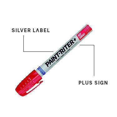
The Mark of Work™New High-Performance, Application Specific Plus Series
The combination of categorization, branding, color indication, packaging, legacy designations and the new application specific Plus Series, results in a more concise and easily identifiable brand with products clearly labeled for specific performance applications that appeal to both our existing and new customers. This is the new look of Markal®. This is #TheMarkOfWork

We’d love to see what you’re working on! Show us your mark of work using our products on social media by tagging us and using #themarkofwork. You may be the next feature on our social channels.
LA-CO Industries, Inc. takes pride in supporting the hardworking contractors and workers that build the world’s greatest bridges, ships, automobiles, aircraft, homes, office towers, power plants and many other engineering marvels.


Comments 0